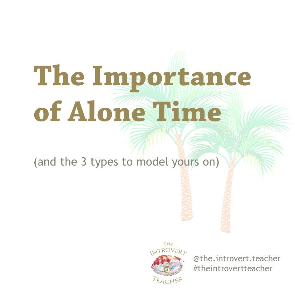
Not too long ago, I was introduced to Instagram Carousels.
Though I professed in an earlier post that I was tired of social media and had essentially stopped uploading content for the sake of doing so, I thought that making some Carousels might help me to hone my design skills and teach me something.
I didn’t go into it with the hope of gaining a tonne of followers or garnering avalanches of likes and comments, as I already knew that social media only rewards those who slavishly post and spend an inordinate amount of time on it.
No, I decided to do it for my own benefit.
And I believe that I have already learned a few design tricks that I wouldn’t have otherwise.
The initial template took some time to carve out, but once it was in place, it wasn’t hard to put in content in the same format. This was part of the first carousel I made.
And this is part of the second one that I made, based on the same template for the first.
And, of course, I’ve made a few more since then.
Now that I’ve figured out a template for this, I might go on to make templates for other things that I’m thinking of dabbling in - infographics, e-flyers, and so on.
Actually, I’ve produced a couple of e-brochures earlier, to help market my newly-written courses for the school market. They were what partly inspired me to see if I could bring what I learned about designing them into a carousel.
I intend to continue producing e-brochures - this time for corporate courses and public workshops.
Let’s see where it goes!


